


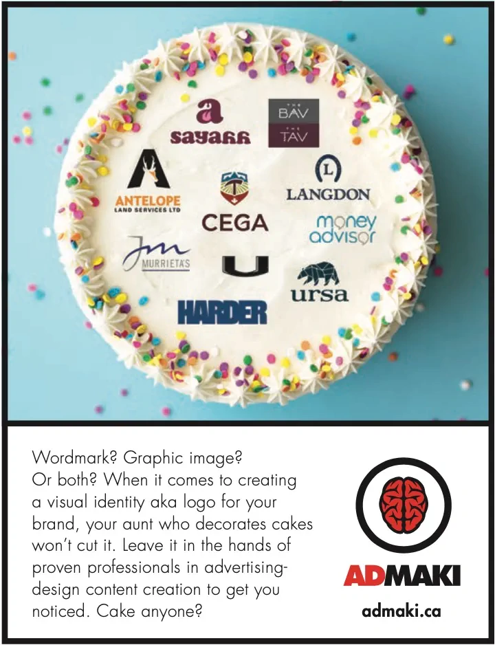
Your logo. Graphic or wordmark?
Its March already! February sure left a mark. Frostbite. Speaking of marks, let’s talk about types of logos. First, let me define each. A logo represents your company’s brand. It can be composed of a wordmark, a graphic design or a combo of both. Some go as far as even having a sound associated with it.
A logo, or visual identity (what I refer to them as), serve as the face of your brand. They create recognition and communicate your brand values on signage, packaging, advertising, etc, wherever your target audience interacts with your business. It should be simple, easily identifiable and most important, be memorable. It should evoke an emotional response. A well-designed logo is crucial to any brand’s marketing and future success. Many entrepreneurs take for granted the importance of this aspect of their brand. You want to build recognition.
Now there are a couple of directions to look at when designing a logo. It’s like trying to select the right vehicle to buy for your needs. A Ford F150 truck might associate you with being hard working and tough while a Mustang convertible might suggest you are carefree and outgoing. Each comes with its own vibe. Its own purpose.
Let’s start with wordmarks. In its simplest form, a logo that’s a wordmark is one which uses just text. Think Coca-cola or Google. The name is front and centre. Not much work required to get your name in the mind of your target audience. These companies are counting on aspects of their brand to do some heavy lifting such as having a unique product or offer great service. They also count on the fact that their names aren’t common. So, there’s an opportunity to make them memorable with lots of repetition, aka advertising.
A wordmark comes in handy if you provide a unique product or service, and you want to get immediate brand awareness. A graphic logo on its own takes longer to establish. Ideally, if you have a fun, quirky name, a wordmark will allow for a creative twist. Typography will be key in adding visual appeal.
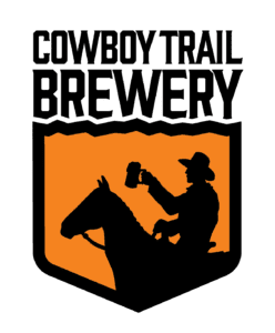
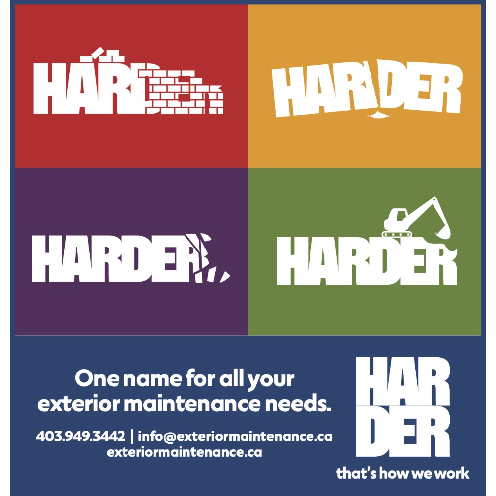
On the other side of the logo coin, you have what I like to refer to as the “bug”. The graphic, visual representation of your brand. A symbol or image. This is where you let your brand speak without saying a word. Think the Nike swoosh or Apple’s apple. These logos are iconic and recognizable worldwide. They break language barriers.
Now when it comes to graphic logos, you won’t catch me using a wrench in your logo if you’re a plumber. That’s a DIY solution. I create stories with each logo design. Your logo can give a hint of your business but not give it away. A good bug starts conversations.
Personally, 99% of the time when designing a brand identity, I’ll use a combination of a graphic and wordmark. This allows you flexibility in application as your brand grows.
Regardless, whether you use a wordmark, graphic, or both, your brand identity should reflect your personality, your business and make your customer feel confident in interacting with your brand. Be unique. Be memorable.
Cheers, mark.


 Free Classifieds