Make sense of colors
If you’re hunting for Easter eggs and happen to step into the office of AdMaki Creative, one of the first things that hits you is colour. As you climb the staircase, you’ll find each wall is adorned with its own colour. This is intentional. Green is used to calm down Kate and Tanya when I “F-up” or when a client calls with unrealistic requests. Red, a stimulating colour on our chairs, works like caffeine after you’ve already had four cups before noon, helping us keep the ideas flowing. And yellow is considered high-energy to keep the brain working as you’re coming down from your caffeine high.
Stepping into an office such as ours is our way of introducing clients to one of the tools we use. Colour. It’s fundamental to our craft. It is an integral part of the “eye candy” we create daily. So, with that in mind, I want to welcome you to the world of colour and give you a taste of my favourite hues (the professional industry term for colour).
Let’s start with red. Tanya’s favourite hue. It’s the colour of passion, danger, and my Jeep. The colour red can raise your heart rate and spike adrenaline levels. I do that to Tanya every day (as anyone who knows, I can be somewhat overbearing, judgemental, or even scatterbrained). Red is also used in creative marketing solutions when one wants to grab the attention of their target audience to create a sense of urgency or to evoke an emotional response. Red gets attention. Think stop signs.
How about blue? You won’t find this hue on any wall in our office as it’s a colour that I would consider bipolar. It can be both peaceful and calming. Think sky or the ocean. This color supposedly lowers your blood pressure and induces tranquility. It can also make you feel cold and depressed. Maybe your downtown office is painted blue. It was done with good intentions as it is often used by companies to evoke professionalism and productivity. Tech, health, government and financial institutions use this colour in their marketing to bring to mind a sense of trust and security.
Green. Kate’s favourite colour. It’s the colour of wealth, balance and nature. It’s also the colour of envy. Kind of makes you want to meditate in a forest whilst sipping a fresh coffee wrapped in your coziest blanket on an early summer morning. Soothing and relaxing. While it’s -15oC here, there’s someone doing that in another part of the world right now. I envy that.
Finally, yellow. Number one on my list. In marketing, it is used to grab attention, create feelings of happiness, youthfulness, and playfulness. Yellow is full of energy, like the sun. It’s bright and warm (like my fleece-lined Crocs). It stimulates creativity and raises spirits. But use it in moderation, like a lemon, too much can be overstimulating to the senses (did I just dis myself ?).
Colors manipulate our emotions. So the next time you find yourself overwhelmed by the walls of your surroundings or the brightness of your footwear, just remember, it’s not you. It’s the color.
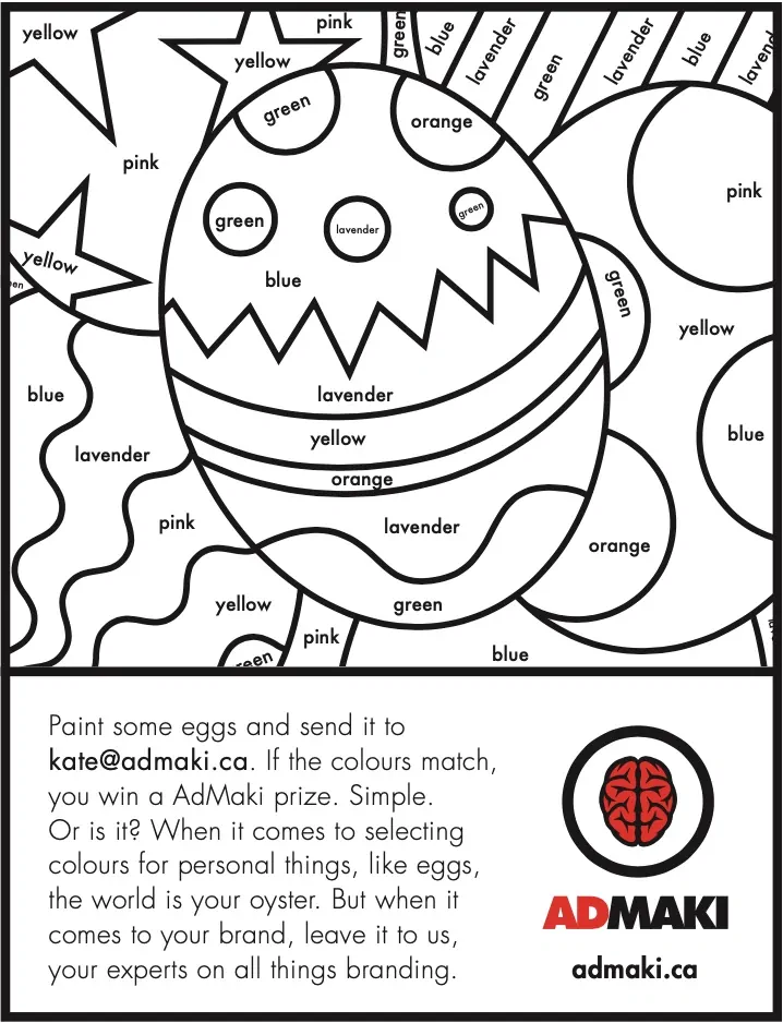
Now go paint some eggs.
Cheers, mark.
